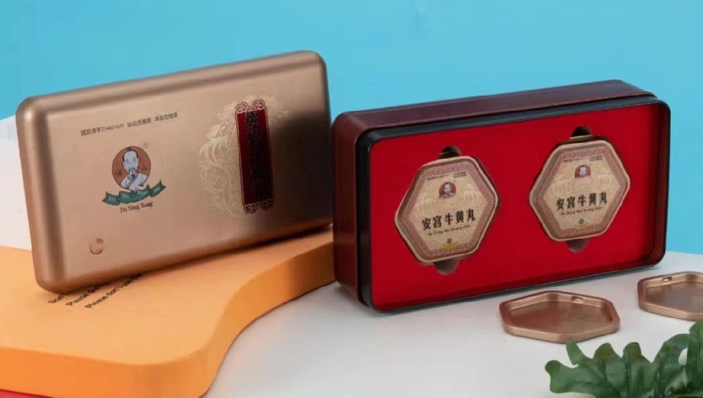
Designing nutritional supplement tins for health and wellness brands involves creating packaging that is both functional and appealing to health-conscious consumers. Here are some design suggestions that can help make your product stand out while conveying a message of wellness and quality:
### Branding and Identity:
1. **Logo Placement:** Ensure that the brand logo is prominently placed and easily recognizable.
2. **Color Palette:** Use a color palette that aligns with health and wellness, such as greens, blues, and earthy tones, to invoke a sense of calm and nature.
3. **Typography:** Opt for clean, readable fonts that evoke a sense of modernity and professionalism.
### Visuals and Graphics:
1. **Imagery:** Include images of natural ingredients, plants, or landscapes to emphasize the natural aspect of the supplements.
2. **Icons:** Use simple icons to represent various benefits or features of the supplement, such as gluten-free, non-GMO, organic, etc.
3. **Infographics:** Consider adding a small infographic that illustrates the health benefits or how the supplement works in the body.
### Material and Sustainability:
1. **Eco-Friendly Materials:** Use recyclable or biodegradable materials to appeal to eco-conscious consumers and communicate a commitment to sustainability.
2. **Texture:** Incorporate a tactile experience with embossed or textured finishes that convey a premium feel.
### Practicality and Function:
1. **Ease of Use:** Design tins that are easy to open and close, possibly with a twist-off lid or a pull-tab for convenience.
2. **Protection:** Ensure that the packaging adequately protects the contents from moisture, light, and air to maintain product integrity.
3. **Size and Shape:** Offer various sizes and shapes to cater to different needs, such as travel-size tins or stackable shapes for space efficiency.
### Informational Content:
1. **Clear Labeling:** Clearly display the supplement facts, dosage instructions, and any necessary warnings.
2. **Educational Content:** Include brief educational content about the supplement’s benefits and suggested usage.
3. **Expiration Date:** Make sure the expiration date is clearly printed in a visible location.

### Marketing and Messaging:
1. **Unique Selling Proposition (USP):** Highlight what sets your product apart, such as a proprietary blend, a unique ingredient, or a special formulation.
2. **Lifestyle Match:** Reflect the lifestyle of your target audience, whether it's active individuals, busy professionals, or health enthusiasts.
3. **Storytelling:** Integrate brand storytelling elements that share the origins of the ingredients or the brand’s mission.
### Compliance and Safety:
1. **Regulatory Information:** Include all necessary regulatory information, certifications, and compliance marks.
2. **Tamper-Evident Features:** Use tamper-evident seals to ensure consumer safety and product authenticity.
### Mockups and Prototypes:
Before finalizing the design, create mockups and prototypes to visualize the tin in a 3D format and test its appeal among potential customers. This step can provide valuable feedback to refine the design further.
Remember that the design of nutritional supplement tins should not only be eye-catching but also resonate with the values and promise of the health and wellness brand. Consistency across different products and lines will reinforce brand recognition and loyalty among consumers.